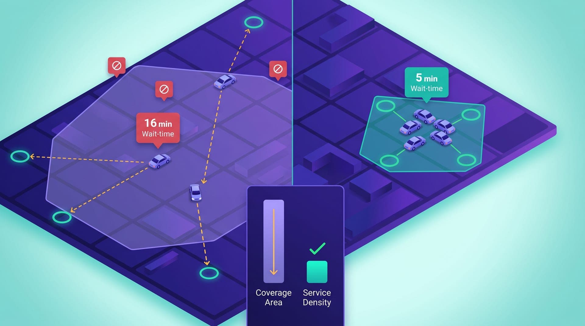
In a regional ride-hailing operation with 40 weekly active drivers, the decision of how many square kilometers to cover has more impact on wait time than the total number of available drivers. An operation covering 120 square kilometers with that fleet distributes supply at a mean density of 0.33 drivers per square kilometer; one covering 45 square kilometers with the same 40 drivers operates at 0.89 drivers per square kilometer. Under equivalent demand conditions, the second operation has wait times 35 to 55% lower, rejection rates 30 to 45% lower, and driver session income per hour 20 to 35% higher — not because it has more resources, but because it concentrates the ones it has in the area where demand justifies the effort. Geographic coverage carries a density cost that most operators never calculate explicitly, and when it is ignored it degrades every operational metric at once.
This article is for the operator with 20 to 80 weekly active drivers who is considering expanding their coverage zone, who has had elevated wait times for months without being able to diagnose the cause, or who has just detected that peripheral zones are producing systematic rejections and unserved requests. It covers why the relationship between geographic coverage and service density determines most operational metrics in mid-sized fleets, how to measure trip density by zone with available data, what signals indicate a zone is draining resources without contributing sufficient volume, how to calculate the minimum density threshold that makes operating in an area viable, and what operational and communication decisions are required when reducing coverage is the right intervention. The thesis is uncomfortable for anyone who equates growth with geographic expansion: in markets with 20 to 80 active weekly drivers, operating less area with better density improves passenger, driver, and operator metrics simultaneously.
The wide-coverage trap: more area with the same fleet produces worse service
Wide geographic coverage signals growth. For an operator who just launched or who is competing for visibility with other platforms, having an extensive coverage zone on the app map communicates presence and reach. The problem is that the coverage map and the service density map are two different things. The coverage zone shows where a passenger can request a ride; service density shows how many drivers are available in each area to handle those requests. When coverage expands faster than the fleet grows, service density drops across all zones: the drivers who previously covered 40 square kilometers now cover 120, which reduces their relative presence at any specific point in the city to a third of what it was.
The effect on metrics arrives quickly. A driver 12 minutes from the request origin is 3 times more likely to reject it than one 4 minutes away: the unpaid reposition is a real session cost for the driver. A passenger who waits 14 minutes has a cancellation rate 4 times higher than one who waits 5. And a driver who accepts a 10-minute reposition for an 8-minute trip generates the same session time as for an 18-minute trip but with substantially lower income per active minute. All three effects — driver rejection, passenger cancellation, low driver efficiency — share a single root cause: supply density is insufficient for the coverage area the operator chose. None of those effects resolves itself by adding more drivers until the underlying ratio between covered area and available fleet is corrected first.
How to measure trip density by zone with available data
The core service density metric is the number of completed trips per square kilometer of zone over a given period, compared against the count of unique active drivers in that zone during the same period. The agent query: 'For the last 28 days, show me completed trips grouped by origin zone. For each zone: completed trip count, unique request count — including canceled and unserved requests — median wait time, driver rejection rate, and unique driver count who made at least one trip from that zone.' The result produces a relative density map: zones with high trips per active driver and low wait times versus zones with few trips per driver and high wait times.
What makes this map comparable across zones of different physical size is normalizing volume by area. A zone of 8 square kilometers with 180 monthly trips has a density of 22.5 trips per square kilometer; a 25 km² zone with 160 trips has 6.4 trips/km². The second zone has 25% fewer trips but occupies three times more area: in demand density terms, it does not have the same operational efficiency — not for the waiting passenger nor for the driver covering it. Reference ranges in operations handling 150 to 500 daily trips: zones above 15 trips/km²/month have demand density that justifies systematic active driver availability; between 5 and 15 trips/km²/month, they are viable with reduced availability during peak hours; below 5 trips/km²/month, they rarely justify a driver positioning there in anticipation. Area size does not define viability: the concentration of requests within the area does.
The signals that a zone is degrading the operation
The indicators that flag a problematic coverage zone fall into three types. The first is sustained elevated wait time: if a zone has median wait times that double the rest of the operation for three or more consecutive weeks, supply density within that perimeter is insufficient for the demand arriving there. The second is a persistently high rejection rate: a zone above 22 to 25% rejection consistently signals that drivers receiving requests from there are systematically rejecting because the reposition distance doesn't make sense for them. The third is a low served-request rate: requests that expire without any driver taking them because no driver is available within the assignment radius. All three signals appearing simultaneously in the same zone for more than 21 days are sufficient to diagnose that maintaining coverage there may not be operationally warranted.
What makes these signals hard to detect is that the standard dashboard shows operation-wide averages. A zone with 18-minute wait times can be offset in the average by zones showing 4 minutes, making the aggregate indicator look acceptable. An operator who only reviews the global average doesn't see the concentrated degradation in peripheral areas until weeks of dissatisfied passengers have accumulated and drivers have stopped connecting in those zones because they find them unproductive. That double effect — lower driver availability in the zone because it doesn't work for them, higher passenger dissatisfaction because they wait longer — feeds itself and intensifies over time. Zone-level segmentation, the same query that detects hourly peaks and systematic rejections, is the instrument for seeing that degradation before it reaches the global average.
Zone viability analysis: how to calculate whether an area contributes or drains the operation
Zone viability analysis has four components: the volume of requests the area generates, the wait time it produces, the rejection rate of its requests, and the number of drivers currently covering it. For a zone to be operationally viable, there need to be drivers who can handle its requests without repositioning more than 6 to 8 minutes away — implying that drivers must be positioned in or near the zone during its highest-demand hours — and the trip volume must justify the opportunity cost for a driver who positions there instead of in denser zones. The agent query that enables this analysis: 'For each zone with a rejection rate above 18% in the last 30 days, show me: completed trip count, requests that expired without being served, median wait time, drivers who made at least one trip there, and average income per trip in that zone compared to the operation-wide average.'
The viability reference that works in operations handling 200 to 600 daily trips: a zone is marginally viable if the average income per driver per hour in that area is no more than 25% below the average in the highest-density zones. A zone generating 120 MXN per hour per driver when dense zones generate 200 MXN is marginal but not unviable if it has captive demand — passengers with no nearby transport alternative. A zone generating 75 MXN per hour when dense zones generate 200 MXN does not justify active positioning: the driver who covers it incurs session costs — fuel, time — that exceed the differential return of being there versus the more productive alternatives available. The operator who has that figure for each zone has the complete map of which areas are sustaining the operation and which are quietly subsidizing it.
When and how to reduce the coverage zone: the decision protocol
The condition that justifies reducing the coverage zone is the simultaneous presence of three indicators for more than 30 days: zone median wait time above double the operation average, driver rejection rate above 22%, and demand density below 5 trips per square kilometer per month. When all three conditions hold at once, keeping the zone active doesn't just produce a poor experience within it: it degrades the metrics of adjacent zones because drivers who reposition to the periphery become unavailable for requests in denser zones during the reposition time. That is a geographic cost distributed across the entire operation.
The coverage reduction protocol has three phases that must be executed in sequence:
- **Driver communication**: notify active drivers which zone will lose active coverage, on what date, and what positioning alternative they have in the nearest viable zone. Useful specifics: how many requests that zone generated in the last month and what the estimated hourly income is in the alternative zones. A driver who receives that context understands the change as a productivity improvement, not an arbitrary restriction.
- **Coverage polygon update in the app**: remove the zone from the visible request area or add a limited-coverage indicator so that requests from that perimeter stop entering the assignment system during low-availability slots. If the platform supports zone-level coverage scheduling, restricting peripheral coverage to the hours with the highest demand concentration — rather than closing it entirely — preserves access for passengers who use it during peak activity while eliminating the drag on adjacent zones during low-density hours.
- **Impact monitoring over the following 21 days**: compare median wait time and rejection rate in adjacent zones before and after the change. The clearest sign the reduction worked is that wait times in zones that kept coverage dropped — indicating that drivers who previously repositioned to the periphery are now available for requests in higher-density zones. In operations where this protocol has been executed, improvement in the active zones typically appears within the first two weeks of the change.
I had coverage across the whole city: 180 square kilometers. I was seeing problems in the peripheral zones — high rejections, long waits — but I assumed it was a driver count problem. The agent showed me those zones were generating three trips in an entire month. Three trips. I had drivers going there and getting stranded because there were no nearby requests for the next ride. I reduced coverage to 60 square kilometers — the zones where 90% of demand was concentrated. Wait times dropped in the active zones, rejections dropped, and drivers who were reaching 8 or 10 trips per session started hitting 13 or 15 because they stopped losing time going to empty areas.
How to communicate coverage changes without losing passengers or drivers
The main objection to reducing coverage area is losing passengers in the zones left out. That objection makes sense if those passengers generate a trip volume that justifies the coverage — in which case the low-density conditions that warrant reduction don't hold. If the zone has fewer than 5 trips per square kilometer per month, passengers originating from there are, by definition, very low frequency: their individual retention value is low compared to the operational cost of maintaining that coverage and to the negative effect that maintenance has on the denser zones. The passenger communication in that case is direct: an app notification with the date of the change, the approximate affected area, and the nearest pickup alternative at the boundary of the new coverage zone. If there is a commercial point or a main avenue at the edge of the new polygon, that location becomes the concrete reference the passenger can use to continue accessing the service.
For drivers, the framing is the opposite. A driver who was covering the peripheral zone doesn't lose trips with the reduction — the zone wasn't generating enough. They recover productive time previously spent repositioning to that area and returning without completing an additional trip. Effective communication includes concrete data: 'Zone X had 4 requests in the last month. The average reposition time to that zone from the highest-demand areas is 14 minutes. With those 14 minutes positioned in the central or northern zone, the probability of receiving a request within the next 5 minutes is 4 times higher.' That context turns the coverage reduction into a session income improvement for the driver — not a movement restriction — because the driver understands that the change eliminates zero-return repositions that were lowering their hourly productivity. The decision that looks contractionary on the map is, in practice, expansionary for the metrics that matter.
Geographic coverage in ride-hailing is not linear: a 50% increase in covered area without an equivalent increase in the active fleet doesn't produce 50% more potential passengers — it produces a proportional deterioration in the metrics of the zones that were already working. An operator who evaluates their coverage zone with the same rigor they apply to driver shifts or rejection rate has access to an improvement lever that requires neither hiring more drivers nor changing fares: simply concentrating existing supply where demand is sufficient for both the passenger and the driver to have an operationally sustainable experience. That concentration is not a retreat — it is the condition that allows growth with quality when the fleet finally warrants it.
The decision to reduce coverage is counterintuitive for an operator who equates growth with geographic expansion. But in regional markets with 20 to 80 active weekly drivers, service density in the right zones has more impact on passenger retention, driver income, and operational sustainability than any map expansion that dilutes available resources. The zone viability review — one monthly agent query, 30 minutes of analysis — is the difference between operating across the full map and operating well on the map the current fleet can serve with quality. The sustainable coverage zone is not the largest possible one: it is the one that fleet density and demand concentration make viable without sacrificing passenger experience or driver income.