A single fare for the whole city is the most comfortable launch decision and the most expensive one six months later. Downtown it charges more than passengers will pay for a short, congested trip; on the outskirts it charges less than it costs the driver to go there and come back empty. Fare zones exist to fix both losses at once, and drawn well they are the most profitable pricing tool a regional operator has.
This article is for app-based taxi operators and regional fleets that already have at least two or three months of recorded trips and want to move from a single fare to a zone-based scheme. We will cover how to draw the first zones from data, how many to have, how to price trips that cross from one zone to another, and when to redraw them.
Why a single fare loses money at both ends of the city
A single fare assumes every kilometer costs the same, and in a regional city that is almost never true. Downtown, a driver picks up the next passenger within minutes; in an edge neighborhood or a nearby satellite town, the return trip is usually empty. If both trips are priced the same per kilometer, drivers learn quickly which ones pay and start rejecting the second kind, which is exactly where your passengers need the service most.
On the other side, downtown the single fare tends to be high for two- or three-kilometer trips that passengers compare against walking, public transit or the street taxi stand. There you lose volume without anyone telling you: the trip simply is not requested. Zones let you lower the price where demand is sensitive and raise it where the real cost is higher, instead of averaging both and losing on both.
How to draw the first zones: start from trips, not from the map
The most common mistake is to open the map and draw zones following neighborhoods or administrative boundaries. Those boundaries say nothing about how your passengers move or how much it costs a driver to operate there. The right order is the reverse:
- Export two or three months of trips with origin, destination, time and pickup time.
- Mark on the map where origins concentrate: that is your highest-density zone.
- Identify the areas where pickup time consistently exceeds the average.
- Find the destinations from which drivers almost always return empty.
- Draw the first boundary where those patterns change, not where the neighborhood name changes.
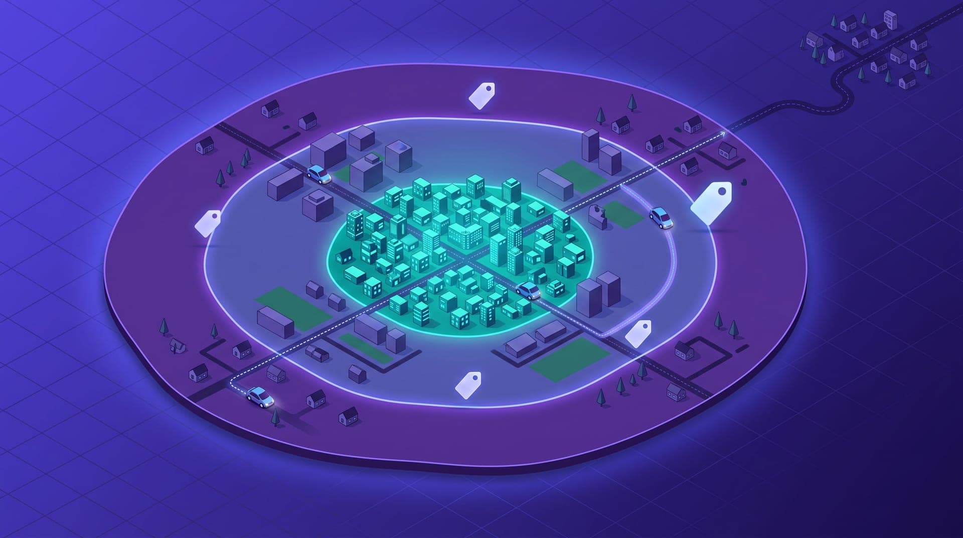
That almost always produces three natural areas: a dense core, an intermediate ring and an outer periphery or nearby towns. It is a far more defensible starting point than any division by intuition, and it gives you arguments to explain every fare if a passenger or driver asks why.
How many zones to have: the mistake of drawing twenty
Once operators discover zones, the temptation is to fine-tune: one for the historic center, another for the hotel strip, another for each new subdivision. Every extra zone is one more fare to explain, one more boundary where the passenger sees the price change by crossing a street, and one more number to review each month. In cities of 100,000 to 500,000 people, three to five zones usually capture almost all of the cost difference.
The exception is places with their own logic: the airport, a bus terminal or an industrial park with shift changes. Those places justify a specific zone or fare because their demand behaves differently from the rest of the city, not because it is possible to draw one.
A simple test to see whether you have too many zones: ask a new driver to explain, without looking anything up, how much it costs to go from downtown to each area of the city. If they cannot do it after their first week, the scheme is too complex for your passengers to understand as well, and every doubt becomes a support conversation someone has to handle.
How to price trips that cross from one zone to another
Zone design gets complicated with trips that start in one zone and end in another. There are three reasonable approaches, and what matters is choosing one and applying it consistently. The first charges by origin zone, which is the easiest to explain. The second charges by destination zone, useful when the real cost is the empty return from the periphery. The third applies the origin fare plus a fixed surcharge for crossing into the outer zone.
For most regional operations the third approach is the most balanced: passengers understand that leaving the city costs a bit more, and drivers get clear compensation for the return trip. What you should avoid is mixing approaches case by case, because frequent passengers notice the inconsistency before anyone else.
Whatever approach you choose, publish it somewhere passengers can check before requesting a trip, and make sure the estimated price they see in the app already includes the surcharge. Most zone-related complaints do not come from the fare itself, but from a final amount different from what the passenger expected when confirming.
What zones change about where your drivers position themselves
Zones do not only move the price: they move the fleet. When the periphery pays what it costs, drivers stop rejecting those trips and some start waiting near those areas at the hours when demand leaves downtown. If you also use a demand surcharge configurable by zone, you can turn it on only where supply is short instead of raising prices across the whole city at every peak.
Communicate it to your drivers with concrete numbers: how much a typical trip to the periphery pays now versus before. A fare change the driver does not understand does not change their behavior, and that change is precisely the goal of zones.
A side effect worth watching is concentration: if one zone clearly pays better, several drivers may pile up there and leave downtown short of supply at high-demand hours. During the first weeks, check pickup time in the core; if it worsens, the difference between zones is too large and needs to be reduced before downtown passengers notice.
For a year we charged the same across the whole city and wondered why nobody wanted to go to the northern neighborhoods. When we set up three zones and a surcharge for heading out to the nearby towns, rejections in that area dropped by more than half within six weeks. We didn't raise the downtown price; we lowered it slightly, and that's where we grew the most.
When to redraw zones: the signals in your data
Zones are not permanent. Cities grow, new subdivisions and shopping centers open, and commuting and school flows change. Review your scheme every quarter and redraw it when any of these signals appears:
- The rejection rate in one zone rises steadily compared to the others.
- Pickup time in a new area exceeds that of the current periphery.
- A new demand hub appears right on a boundary and splits trips into two fares.
- Passengers in one zone complain about the price more often than the rest.
- Most trips from one zone always end in another specific zone.
When you redraw, change one boundary at a time and leave it for at least a month before touching the next one. If you move three boundaries in the same week, you will not be able to tell which change explains what happens to rejections, volume or complaints, and the next review will start from scratch again.
A price that reflects the real cost of every trip
Fare zones are not a way to charge more: they are a way to charge better. A scheme of three to five zones, drawn from your own trips and with a clear rule for crossings, raises acceptance on the periphery, protects volume downtown and gives your drivers reasons to go where they used to refuse.
Start with what you already have: export the last few months of trips and look for where pickup time and empty returns change. That is where your first boundaries are, and with them a price that finally reflects what each trip costs in your city.